by Kathleen Ernst
“So,” my agent said recently, “don’t take this the wrong way, but you need some new author photos.”

But I’m a low-key person. I never wear suits. I rarely wear makeup or pantyhose. I wanted to supplement the “For the Media” page on my website with some casual photos as well. Shots that reflected both my personality and my new Chloe Ellefson/Historic Sites series. Fortunately, I have a professional photographer friend who thought that a day spent taking pictures at Old World Wisconsin (setting for Old World Murder) sounded like a good time.
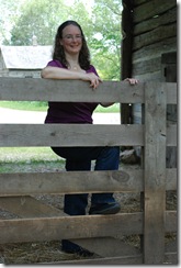
So I’m borrowing an idea Beth Groundwater had a while back (imitation equals flattery, right?) and posting some shots below. I’d like to narrow the field to a top pick for full figure (Group A), and top pick for tighter views (Group B). What do you think? I’d love your opinion! (All photos by Kay Klubertanz.)
Group A:
A1
A2
A3
Group B:
B1
B2
B3
Which are your favorites? And…how do you choose to present yourself to the world?


20 comments:
Personally, I like the "A" series, with A2 being my favorite. The "A" series is contemporary, yet conservative. They are also stylish and professional.
I like A1 and A3 the best. The blue outfit is outstanding on you!
A2 and B1, but they're all good.
Nice pictures!
A2 and B1 are my favourites.
Both give an impression of warmth through the colours.
Jessie Mac
www.jessiemac.com
They're all great, lucky you! I like A1 and B2 best.
A1 and B1. The all-one-color outfit in A1 makes a nice clean flowing line, rather than cutting you in half. & I like your expression in B1.
I choose A1 and B1. All pics are good but these are my favorites.
Fun! I love A1. You look relaxed, professional, and approachable. I think B1 is a great shot but a little dark for a book cover, and so I'd pick B3 out of the second line-up because you look like someone I'd like to hang out with in that photo (in all of them, actually).
I like A1 (that blue is fabulous) and B3 the best. I just got new professional headshots done in May. It was a fun experience with a great photographer, but deciding on a handful of shots out of over 100 was a pain, though some were EASY to eliminate. Nice job, Kathleen.
Thanks for the input! In the A series, I had a hard time choosing between 1 & 2. So far it looks like 1 has a slight edge.
It's so interesting to hear how people react to various images! I appreciate the comments.
And maybe I should ask another question as well: if someone asks for a photo (for a poster for a booksigning, etc) would you go with the formal headshot at the top of the page? Or would you choose one of the casual ones? Some people push for the studio shots. As a reader, would you be put off by a shot of someone wearing jeans?
Hi Kathleen,
Of all the photos, I think your headshot is the best, and that's the one you should send if people ask for a photo. Of the others, in B1, half of your face is in shadow and in B3, part of it is washed out by the sun and the bright light is making you squint, so neither one of those works for me. Also, in A3, you're in the shadow, so that doesn't work. I like A1 and B2 best, for the lighting, the naturalness of your smile, and the naturalness of your body posture. I think you're kind of stiff in some of the others.
I KNOW how hard it is to get good author photos!
A1 & B1. Cropping can serve to give some different looks. They all turned out great.
A1 and B1.
Thanks for the feedback! Tally, from here and from my FB page:
A1 - 15
B1 - 8
B3 - 7
A2 - 5
B2 - 4
A3 - 3
A2 and B2. I am drawn more to B1 but the shadows are distracting, so B2 it is. :)
Probably a little late on the reply, though.
It's never too late - I appreciate your comment!
Go with A2 and A3. They are both flattering, casual on one side (A2) and professional on the other (A3). Should be marketable for book jackets and posters.
Glenna
I like A1 and B3 for posters. B1 would make a pretty poster except not sure about the shadows on your face. Good Luck!
Thanks again - I really appreciate the feedback.
Post a Comment